
Exploring the Data Graphing Data Interpret As you saw in the individual value plot,the means for each center are different.The results mean delivery times are: Central-3.984 days Eastern-4.452 days Western-2.981 days The grouped histogram shows that the Central and Eastern centers are similar in mean delivery time and spread of delivery time.In contrast,the Western center mean delivery time is shorter and less spread out.Chapter 3,Analyzing Data,shows how to detect stastistically significant differences among means using analysis of variance. If your data change,MINITAB can automatically update graphs.For more information,go to Update (Editor menu)in the MINITAB Help index. Edit Editing graphs in MINTTAB is easy.You can edit virtually any graph element.For the histogram histogram you just created,you want to: Increase the size of the text in the legend(the table with the center information) and the table that contains the Mean,StDev,and N ■Modify the title Change the output table font E出gnd 1 Double-click the legend. Astun]Lecan Fat SMe 2 Click the Font tab. 3 Under Size,choose 10. 4 Click OK gwnE习 人C0M在 5 Repeat steps 1-4 for the table. Change the title E山合 1 Double-click the title(Histogram of Days). 2 In Text,type Histogram of Delivery Time. 3 Click OK Cot Autnie可 AaBbCcXxYyZz Meet MINITAB 2-5
Exploring the Data Graphing Data Meet MINITAB 2-5 Interpret results As you saw in the individual value plot, the means for each center are different. The mean delivery times are: Central—3.984 days Eastern—4.452 days Western—2.981 days The grouped histogram shows that the Central and Eastern centers are similar in mean delivery time and spread of delivery time. In contrast, the Western center mean delivery time is shorter and less spread out. Chapter 3, Analyzing Data, shows how to detect stastistically significant differences among means using analysis of variance. Edit histogram Editing graphs in MINITAB is easy. You can edit virtually any graph element. For the histogram you just created, you want to: ■ Increase the size of the text in the legend (the table with the center information) and the table that contains the Mean, StDev, and N ■ Modify the title Change the output table font 1 Double-click the legend. 2 Click the Font tab. 3 Under Size, choose 10. 4 Click OK. 5 Repeat steps 1–4 for the table. Change the title 1 Double-click the title (Histogram of Days). 2 In Text, type Histogram of Delivery Time. 3 Click OK. If your data change, MINITAB can automatically update graphs. For more information, go to Update (Editor menu) in the MINITAB Help index
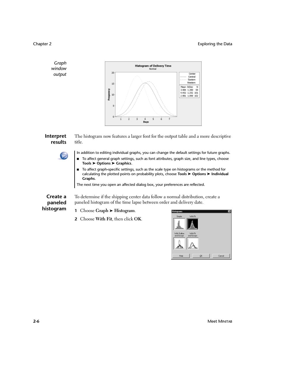
Chapter 2 Exploring the Data Graph Histogram of Delivery Time window Komna1 output 38412099 412101 2.9811090102 Da Interpret The histogram now features a larger font for the output table and a more descriptive results title. In addition to editing individual graphs,you can change the default settings for future graphs. To affect general graph settings,such as font attributes,graph size,and line types,choose Tools Options Graphics. ■ To affect graph-specific settings,such as the scale type on histograms or the method for calculating the plotted points on probability plots,choose Tools Options Individual Graphs. The next time you open an affected dialog box,your preferences are reflected. Create a To determine if the shipping center data follow a normal distribution,create a paneled paneled histogram of the time lapse between order and delivery date. histogram 1 Choose Graph Histogram. 2 Choose With Fit,then click OK. uf作 2-6 Meet MINITAB
Chapter 2 Exploring the Data 2-6 Meet MINITAB Graph window output Interpret results The histogram now features a larger font for the output table and a more descriptive title. Create a paneled histogram To determine if the shipping center data follow a normal distribution, create a paneled histogram of the time lapse between order and delivery date. 1 Choose Graph ➤ Histogram. 2 Choose With Fit, then click OK. In addition to editing individual graphs, you can change the default settings for future graphs. ■ To affect general graph settings, such as font attributes, graph size, and line types, choose Tools ➤ Options ➤ Graphics. ■ To affect graph-specific settings, such as the scale type on histograms or the method for calculating the plotted points on probability plots, choose Tools ➤ Options ➤ Individual Graphs. The next time you open an affected dialog box, your preferences are reflected
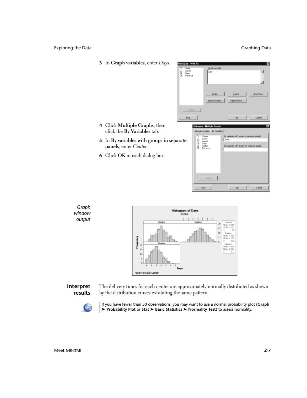
Exploring the Data Graphing Data 3 In Graph variables,enter Days. h女 4 Click Multiple Graphs,then losan-Hutele Geap白 click the By Variables tab. 上学w南四职n军由w士 5 In By variables with groups in separate panels,enter Center. 6 Click OK in each dialog box. Graph window Histogram of Days output 121 Interpret The delivery times for each center are approximately normally distributed as shown results by the distribution curves exhibiting the same pattern. If you have fewer than 50 observations,you may want to use a normal probability plot (Graph >Probability Plot or Stat Basic Statistics>Normality Test)to assess normality. Meet MINITAB 2-7
Exploring the Data Graphing Data Meet MINITAB 2-7 3 In Graph variables, enter Days. 4 Click Multiple Graphs, then click the By Variables tab. 5 In By variables with groups in separate panels, enter Center. 6 Click OK in each dialog box. Graph window output Interpret results The delivery times for each center are approximately normally distributed as shown by the distribution curves exhibiting the same pattern. If you have fewer than 50 observations, you may want to use a normal probability plot (Graph ➤ Probability Plot or Stat ➤ Basic Statistics ➤ Normality Test) to assess normality
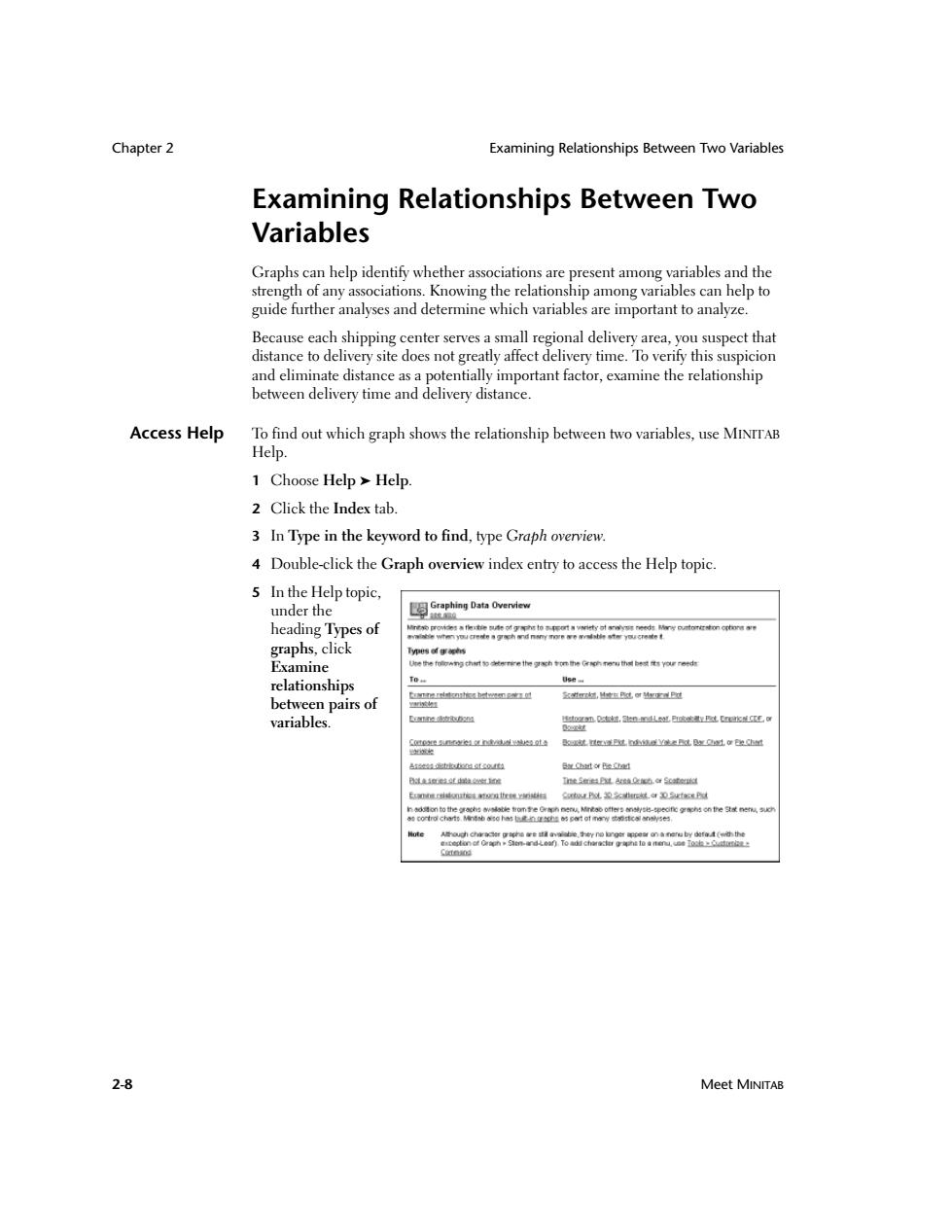
Chapter 2 Examining Relationships Between Two Variables Examining Relationships Between Two Variables Graphs can help identify whether associations are present among variables and the strength of any associations.Knowing the relationship among variables can help to guide further analyses and determine which variables are important to analyze. Because each shipping center serves a small regional delivery area,you suspect that distance to delivery site does not greatly affect delivery time.To verify this suspicion and eliminate distance as a potentially important factor,examine the relationship between delivery time and delivery distance. Access Help To find out which graph shows the relationship between two variables,use MINITAB Help. 1 Choose Help Help 2 Click the Index tab. 3 In Type in the keyword to find,type Graph overview. 4 Double-click the Graph overview index entry to access the Help topic. 5 In the Help topic, under the heading Types of t响o斜s杨t限和ygn标an书时needs outorr红nGt和v第 ew四Tw减物身学内d作理称带雪d标十y国乙Tw减标【 graphs,click ytso事wts Examine 特he folowng ch时粉城re the gragh on the Grsoh noru th国bs城you roe relationships tornerdstnrtezhetwengao里 红T以,在B感克P过 between pairs of 组 variables. 的透沙D m超,nn出L这速LkM还 atotoostco.4ta a过tor Be Bta室超维 1t9BLA线0b.aSc球a E减维试标线对v对ng CopL26rk.台DeBd Cuteod 2-8 Meet MINITAB
Chapter 2 Examining Relationships Between Two Variables 2-8 Meet MINITAB Examining Relationships Between Two Variables Graphs can help identify whether associations are present among variables and the strength of any associations. Knowing the relationship among variables can help to guide further analyses and determine which variables are important to analyze. Because each shipping center serves a small regional delivery area, you suspect that distance to delivery site does not greatly affect delivery time. To verify this suspicion and eliminate distance as a potentially important factor, examine the relationship between delivery time and delivery distance. Access Help To find out which graph shows the relationship between two variables, use MINITAB Help. 1 Choose Help ➤ Help. 2 Click the Index tab. 3 In Type in the keyword to find, type Graph overview. 4 Double-click the Graph overview index entry to access the Help topic. 5 In the Help topic, under the heading Types of graphs, click Examine relationships between pairs of variables

Examining Relationships Between Two Variables Graphing Data 山a睡鲜拉维renidanetbase ree pos pers碱efk的理 +D时13nptt0d时e标oof有 。tbbnhes betene he vu,,ndingeone球ol ed sccsrston and wasr i ne国n Mrrie Pot 陶 This Help topic suggests that a scatterplot is the best choice to see the relationship between delivery time and delivery distance. For help on any MINITAB dialog box,click Help in the lower left corner of the dialog box or press F1.For more information on MINITAB Help,see Chapter 10,Getting Help. Create a 1 Choose Graph>Scatterplot. Scatelsls scatterplot 2 Choose With Regression,then click OK. Wh DO 3 Under Y variables,enter Days. Under X variables,enter Distance Meet MINITAB 2-9
Examining Relationships Between Two Variables Graphing Data Meet MINITAB 2-9 This Help topic suggests that a scatterplot is the best choice to see the relationship between delivery time and delivery distance. Create a scatterplot 1 Choose Graph ➤ Scatterplot. 2 Choose With Regression, then click OK. 3 Under Y variables, enter Days. Under X variables, enter Distance. For help on any MINITAB dialog box, click Help in the lower left corner of the dialog box or press 1. For more information on MINITAB Help, see Chapter 10, Getting Help