Chapter 1 What Next Delivery status("On time"indicates that the book shipment was received on time; “Back order”indicates that the book is not currently in stock;“Late”indicates that the book shipment was received six or more days after ordered) Distance from shipping center to delivery location For more information about data types,see MINITAB Data on page 11-5. What Next Now that you have a worksheet open,you are ready to start using MINITAB.In the next chapter,you use graphs to check the data for normality and examine the relationships between variables. 1-6 Meet MINITAB
Chapter 1 What Next 1-6 Meet MINITAB ■ Delivery status (“On time” indicates that the book shipment was received on time; “Back order” indicates that the book is not currently in stock; “Late” indicates that the book shipment was received six or more days after ordered) ■ Distance from shipping center to delivery location What Next Now that you have a worksheet open, you are ready to start using MINITAB. In the next chapter, you use graphs to check the data for normality and examine the relationships between variables. For more information about data types, see MINITAB Data on page 11-5

透 2 Graphing Data Objectives In this chapter,you: Create and interpret an individuals value plot,page 2-2 Create a histogram with groups,page 2-4 Edit a histogram,page 2-5 Arrange multiple histograms on the same page,page 2-6 ■Access Help,page2-8 Create and interpret scatterplots,page 2-9 Edit a scatterplot,page 2-10 Arrange multiple graphs on the same page,page 2-12 Print graphs,page 2-13 Save a project,page 2-13 Overview Before conducting a statistical analysis,you can use graphs to explore data and assess relationships among the variables.Also,graphs are useful to summarize findings and to ease interpretation of statistical results. You can access MINITAB's graphs from the Graph and Stat menus.Built-in graphs, which help you to interpret results and assess the validity of statistical assumptions, are also available with many statistical commands. Graph features in MINTTAB include: A pictorial gallery from which to choose a graph type Flexibility in customizing graphs,from subsetting of data to specifying titles and footnotes Meet MINITAB 2-1
Meet MINITAB 2-1 2 Graphing Data Objectives In this chapter, you: ■ Create and interpret an individuals value plot, page 2-2 ■ Create a histogram with groups, page 2-4 ■ Edit a histogram, page 2-5 ■ Arrange multiple histograms on the same page, page 2-6 ■ Access Help, page 2-8 ■ Create and interpret scatterplots, page 2-9 ■ Edit a scatterplot, page 2-10 ■ Arrange multiple graphs on the same page, page 2-12 ■ Print graphs, page 2-13 ■ Save a project, page 2-13 Overview Before conducting a statistical analysis, you can use graphs to explore data and assess relationships among the variables. Also, graphs are useful to summarize findings and to ease interpretation of statistical results. You can access MINITAB’s graphs from the Graph and Stat menus. Built-in graphs, which help you to interpret results and assess the validity of statistical assumptions, are also available with many statistical commands. Graph features in MINITAB include: ■ A pictorial gallery from which to choose a graph type ■ Flexibility in customizing graphs, from subsetting of data to specifying titles and footnotes
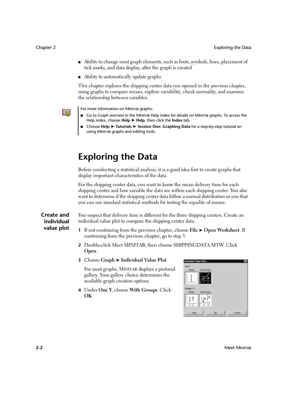
Chapter 2 Exploring the Data Ability to change most graph elements,such as fonts,symbols,lines,placement of tick marks,and data display,after the graph is created Ability to automatically update graphs This chapter explores the shipping center data you opened in the previous chapter, using graphs to compare means,explore variability,check normality,and examine the relationship between variables. 嗣 For more information on MINITAB graphs: Go to Graph overview in the MINITAB Help index for details on MINITAB graphs.To access the Help index,choose Help>Help,then click the Index tab. ■ Choose Help Tutorials>Session One:Graphing Data for a step-by-step tutorial on using MINITAB graphs and editing tools. Exploring the Data Before conducting a statistical analysis,it is a good idea first to create graphs that display important characteristics of the data. For the shipping center data,you want to know the mean delivery time for each shipping center and how variable the data are within each shipping center.You also want to determine if the shipping center data follow a normal distribution so you that you can use standard statistical methods for testing the equality of means. Create and You suspect that delivery time is different for the three shipping centers.Create an individual individual value plot to compare the shipping center data. value plot 1 If not continuing from the previous chapter,choose File Open Worksheet.If continuing from the previous chapter,go to step 3. 2 Double-click Meet MINITAB,then choose SHIPPINGDATA.MTW.Click Open. 3 Choose Graph Individual Value Plot. For most graphs,MINTTAB displays a pictorial gallery.Your gallery choice determines the available graph creation options. 4 Under One Y,choose With Groups.Click OK. Cacal 2-2 Meet MINITAB
Chapter 2 Exploring the Data 2-2 Meet MINITAB ■ Ability to change most graph elements, such as fonts, symbols, lines, placement of tick marks, and data display, after the graph is created ■ Ability to automatically update graphs This chapter explores the shipping center data you opened in the previous chapter, using graphs to compare means, explore variability, check normality, and examine the relationship between variables. Exploring the Data Before conducting a statistical analysis, it is a good idea first to create graphs that display important characteristics of the data. For the shipping center data, you want to know the mean delivery time for each shipping center and how variable the data are within each shipping center. You also want to determine if the shipping center data follow a normal distribution so you that you can use standard statistical methods for testing the equality of means. Create and individual value plot You suspect that delivery time is different for the three shipping centers. Create an individual value plot to compare the shipping center data. 1 If not continuing from the previous chapter, choose File ➤ Open Worksheet. If continuing from the previous chapter, go to step 3. 2 Double-click Meet MINITAB, then choose SHIPPINGDATA.MTW. Click Open. 3 Choose Graph ➤ Individual Value Plot. For most graphs, MINITAB displays a pictorial gallery. Your gallery choice determines the available graph creation options. 4 Under One Y, choose With Groups. Click OK. For more information on MINITAB graphs: ■ Go to Graph overview in the MINITAB Help index for details on MINITAB graphs. To access the Help index, choose Help ➤ Help, then click the Index tab. ■ Choose Help ➤ Tutorials ➤ Session One: Graphing Data for a step-by-step tutorial on using MINITAB graphs and editing tools
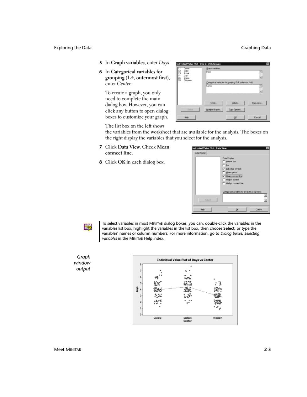
Exploring the Data Graphing Data 5 In Graph variables,enter Days. 6 In Categorical variables for grouping(1-4,outermost first), enter Center. To create a graph,you only need to complete the main dialog box.However,you can click any button to open dialog boxes to customize your graph. The list box on the left shows the variables from the worksheet that are available for the analysis.The boxes on the right display the variables that you select for the analysis. 7 Click Data View.Check Mean connect line Dati Dicday 8 Click OK in each dialog box. 2da减a3n6ot To select variables in most MINITAB dialog boxes,you can:double-click the variables in the variables list box;highlight the variables in the list box,then choose Select;or type the variables'names or column numbers.For more information,go to Dialog boxes,Selecting variables in the MINITAB Help index. Graph Individual Value Plot of Days vs Center window output n x :3 射 南 四 的 2 Central Weren Meet MINITAB 2-3
Exploring the Data Graphing Data Meet MINITAB 2-3 5 In Graph variables, enter Days. 6 In Categorical variables for grouping (1-4, outermost first), enter Center. To create a graph, you only need to complete the main dialog box. However, you can click any button to open dialog boxes to customize your graph. The list box on the left shows the variables from the worksheet that are available for the analysis. The boxes on the right display the variables that you select for the analysis. 7 Click Data View. Check Mean connect line. 8 Click OK in each dialog box. Graph window output To select variables in most MINITAB dialog boxes, you can: double-click the variables in the variables list box; highlight the variables in the list box, then choose Select; or type the variables’ names or column numbers. For more information, go to Dialog boxes, Selecting variables in the MINITAB Help index
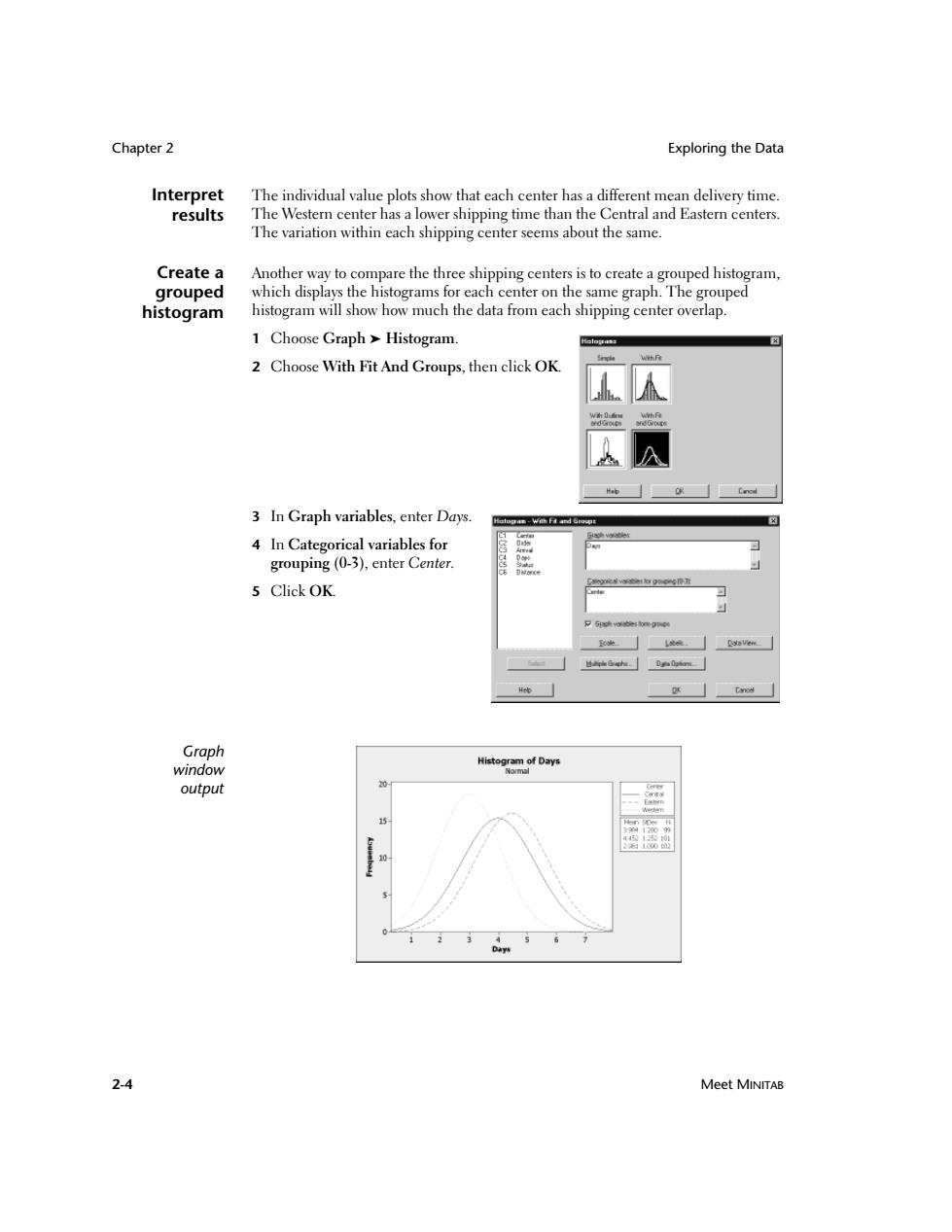
Chapter 2 Exploring the Data Interpret The individual value plots show that each center has a different mean delivery time. results The Western center has a lower shipping time than the Central and Eastern centers. The variation within each shipping center seems about the same. Create a Another way to compare the three shipping centers is to create a grouped histogram, grouped which displays the histograms for each center on the same graph.The grouped histogram histogram will show how much the data from each shipping center overlap. 1 Choose Graph Histogram. 2 Choose With Fit And Groups,then click OK. 3 In Graph variables,enter Days. 4 In Categorical variables for grouping (0-3),enter Center. 5 Click OK. Graph window HictorDays output 2-4 Meet MINITAB
Chapter 2 Exploring the Data 2-4 Meet MINITAB Interpret results The individual value plots show that each center has a different mean delivery time. The Western center has a lower shipping time than the Central and Eastern centers. The variation within each shipping center seems about the same. Create a grouped histogram Another way to compare the three shipping centers is to create a grouped histogram, which displays the histograms for each center on the same graph. The grouped histogram will show how much the data from each shipping center overlap. 1 Choose Graph ➤ Histogram. 2 Choose With Fit And Groups, then click OK. 3 In Graph variables, enter Days. 4 In Categorical variables for grouping (0-3), enter Center. 5 Click OK. Graph window output