
Centers for Disease Control and Prevention Epidemiology Program Office Case Studies in Applied Epidemiology No.751-N99 An Epidemic of Deaths in the London Fog Instructor's Guide case study,the participant should be able to: Construct and interpret graphs of time-related data; Calculate and discuss excess mortality: Discuss thestrengthnd limii of mortality data,and the interpretaion of morality external events;and Construct and interpret a scattergram. This case study was originally developed for the CDC EIS Summer Course by Malcolm Harrington EIS 'xx)in the 1970s. An a ersion was developed at the World Health Organization by and was adapted and revised py Ric U.S.DEPARTMENT OF HEALTH AND HUMAN SERVICES Public Health Service
Centers for Disease Control and Prevention Epidemiology Program Office Case Studies in Applied Epidemiology No. 751-N99 An Epidemic of Deaths in the London Fog Instructor's Guide Learning Objectives After completing this case study, the participant should be able to: G Construct and interpret graphs of time-related data; G Calculate and discuss excess mortality; G Discuss the strengths and limitations of mortality data, and the interpretation of mortality patterns in light of external events; and G Construct and interpret a scattergram. This case study was originally developed for the CDC EIS Summer Course by Malcolm Harrington (EIS 'xx) in the 1970s. An alternative version was developed at the World Health Organization by Todd Kjellström and Nancy Hicks in 1991. The current version contains features from both versions, and was adapted and revised by Richard Dicker in 1999. U.S. DEPARTMENT OF HEALTH AND HUMAN SERVICES Public Health Service
CDC/EIS,1999:London Fog-Instructor's Guide Page 2 PARTI Onthe moing Friday ecember. o Ambulanceby At the annual Smithfield Show.featuring prized and goats. fog was generally considered to be the worst in living memory. London is situated in the valley of the River The fog had far-reaching effects on city life 0amsadns8omhe9et5Relanc8aeae8mab8 Low visibility contributed to numerous traffic covers 720 square miles and is inhabited by8 dents million people by incre Question 1: Mh8gCnomane,mgmyou ect to determine the potential health impact Answer 1: Morbidity Data Hospital discharge data-usually available Hospital discharge data Coroner's records Parpea2neog80pmeaegoseysocok2c Environmental Data(to assess link between environmental factors and health) Daily temperature,wind Measures of air quality air pollution Question 2:Assuming that at least some of the data you want would be available for the current time period.what might you use for a comparison period? ely prec ding the time period of interest,or uring the previous year or years
CDC / EIS, 1999: London Fog - Instructor's Guide Page 2 PART I On the morning of Friday, December 5, 1952, with the temperature just below freezing, a dense fog settled over Greater London. The fog was notable for its density, its duration, and almost complete absence of remission in either density or temperature for four long days. The fog was generally considered to be the worst in living memory. The fog had far-reaching effects on city life. Low visibility contributed to numerous traffic accidents. Emergency services were taxed both by increased demand and poor driving conditions. Ambulance services were kept busy by an apparent increase in people suffering from a variety of illnesses, predominantly respiratory. At the annual Smithfield Show, featuring prized pigs, cows, sheep, and goats, a number of cows died. London is situated in the valley of the River Thames in southeast England, bounded on the north and south by chalk hills. Greater London covers 720 square miles and is inhabited by 8 million people. Question 1: What sources of data might you use to collect to determine the potential health impact of the fog on humans? Answer 1: Morbidity Data • Hospital discharge data - usually available • Clinics, emergency departments • School and employee absenteeism data Mortality Data • Death certificates • Hospital discharge data • Coroner's records Demographic Data (neccesary for providing denominators for rates) • Population by smallest geographic area possible, by age, sex, etc. Environmental Data (to assess link between environmental factors and health) • Daily temperature, wind • Measures of air quality / air pollution Question 2: Assuming that at least some of the data you want would be available for the current time period, what might you use for a comparison period? Answer 2 The two most common comparison time periods are: • the period immediately preceding the time period of interest, or • the comparable time period during the previous year or years
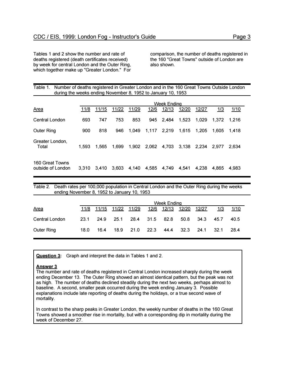
CDC/EIS,1999:London Fog-Instructor's Guide Page 3 Tables 1 and 2 show the number and rate of comparison,the number of deaths registered in deaths registered (received) the 160"Great Towns"outside of London are also shown Week Ending Area 118111151122112912612131220122713110 Central London 6937477538539452.4841.5231.0291.3721.216 Outer Ring 9008189461.0491,1172.2191,6151,2051,6051,418 Lnn 1,5931.5651.6991.9022.0624.7033,1382.2342.9772.634 ae8eatIasn 3,3103,4103,6034,1404,5854,7494,5414,2384,8654,983 Table 2.Deathr Nous per nuary Area 啦2逸2蓝”2亚返四 Central London 23.124.925.128.431.582.850.834.345.740.5 Outer Ring 18.016.418.921.022.344.432.324.132.128.4 Question 3:Graph and interpret the data in Tables 1 and 2. Answer 3 The number and rate of deaths registered in Central London increased sharply during the week baseline.Aseco d.sr maller peak occurred during the week ending January 3.Possible ations include late reporting of deaths during the holidays,or a true second wave of In contrast to the sharp peaks in Greater London.the weekly number of deaths in the 160 Great
CDC / EIS, 1999: London Fog - Instructor's Guide Page 3 Tables 1 and 2 show the number and rate of deaths registered (death certificates received) by week for central London and the Outer Ring, which together make up "Greater London." For comparison, the number of deaths registered in the 160 "Great Towns" outside of London are also shown. Table 1. Number of deaths registered in Greater London and in the 160 Great Towns Outside London during the weeks ending November 8, 1952 to January 10, 1953 Week Ending Area 11/8 11/15 11/22 11/29 12/6 12/13 12/20 12/27 1/3 1/10 Central London 693 747 753 853 945 2,484 1,523 1,029 1,372 1,216 Outer Ring 900 818 946 1,049 1,117 2,219 1,615 1,205 1,605 1,418 Greater London, Total 1,593 1,565 1,699 1,902 2,062 4,703 3,138 2,234 2,977 2,634 160 Great Towns outside of London 3,310 3,410 3,603 4,140 4,585 4,749 4,541 4,238 4,865 4,983 Table 2. Death rates per 100,000 population in Central London and the Outer Ring during the weeks ending November 8, 1952 to January 10, 1953 Week Ending Area 11/8 11/15 11/22 11/29 12/6 12/13 12/20 12/27 1/3 1/10 Central London 23.1 24.9 25.1 28.4 31.5 82.8 50.8 34.3 45.7 40.5 Outer Ring 18.0 16.4 18.9 21.0 22.3 44.4 32.3 24.1 32.1 28.4 Question 3: Graph and interpret the data in Tables 1 and 2. Answer 3 The number and rate of deaths registered in Central London increased sharply during the week ending December 13. The Outer Ring showed an almost identical pattern, but the peak was not as high. The number of deaths declined steadily during the next two weeks, perhaps almost to baseline. A second, smaller peak occurred during the week ending January 3. Possible explanations include late reporting of deaths during the holidays, or a true second wave of mortality. In contrast to the sharp peaks in Greater London, the weekly number of deaths in the 160 Great Towns showed a smoother rise in mortality, but with a corresponding dip in mortality during the week of December 27

CDC/EIS,1999:London Fog-Instructor's Guide Page4 6000 5000 ◆ 4000 300 号2000 1000 200 10-Ja Deaths ◆-Central London-Outer Ring◆-16 0 Towns Death rate in Central London and Outer Ring for weeks onding Nov.8,1952-Jan.10.953 40d 20.0 8-No 20-Nov 200a 270e 3-Jan 。-Central London■-Outer Ring
CDC / EIS, 1999: London Fog - Instructor's Guide Page 4 Deaths in Greater London and 160 Towns by week ending Nov. 8 1952 - Jan. 10, 1953 0 1000 2000 3000 4000 5000 6000 8-Nov 15-Nov 22-Nov 29-Nov 6-Dec 13-Dec 20-Dec 27-Dec 3-Jan 10-Jan Deaths Week ending Central London Outer Ring 160 Tow ns Death rate in Central London and Outer Ring for weeks ending Nov. 8, 1952 - Jan. 10,953 0.0 10.0 20.0 30.0 40.0 50.0 60.0 70.0 80.0 90.0 8-Nov 15-Nov 22-Nov 29-Nov 6-Dec 13-Dec 20-Dec 27-Dec 3-Jan 10-Jan Week ending Death rate per 100,000 Central London Outer Ring
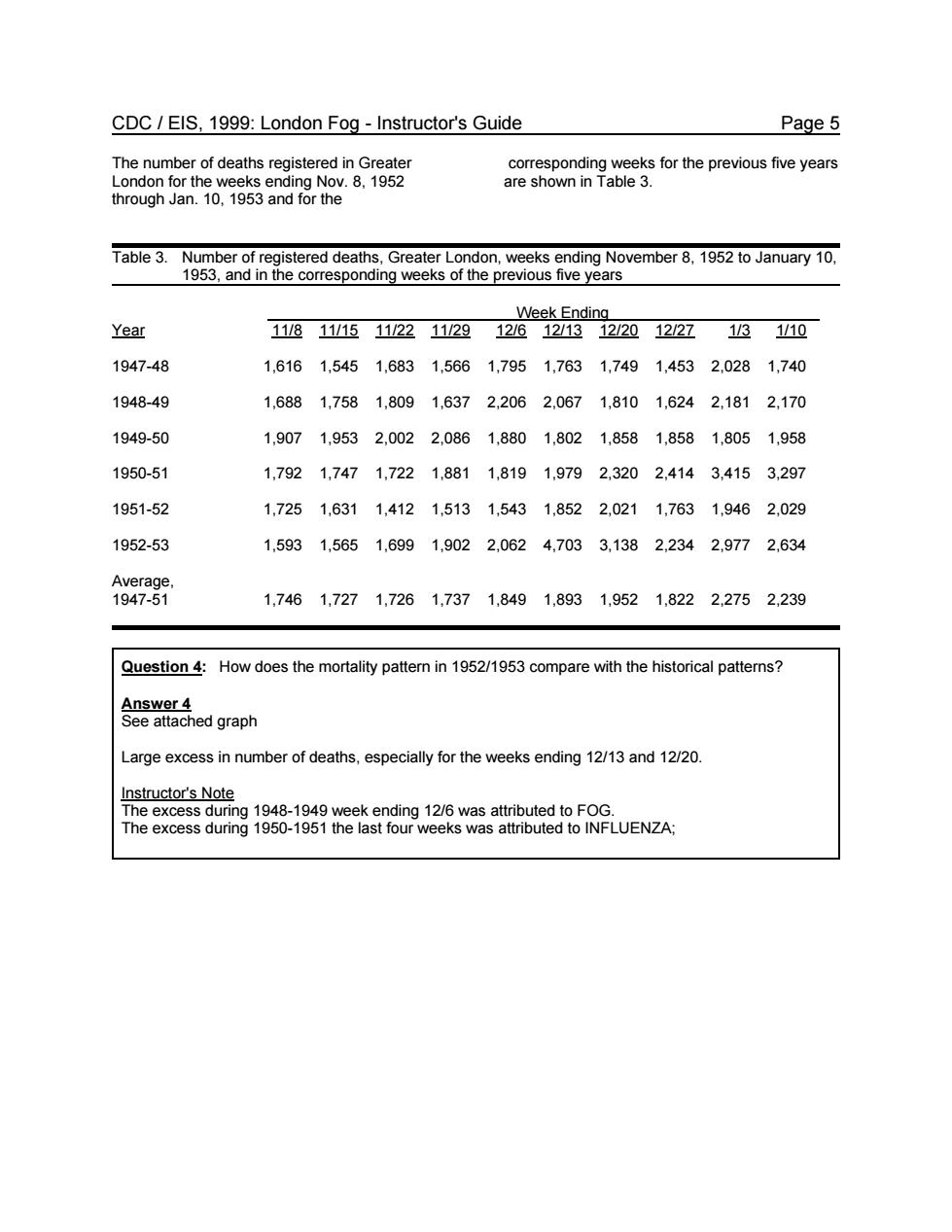
CDC/EIS,1999:London Fog-Instructor's Guide Page 5 The number of deaths registered in Greater Lond the we ending Nov 8.1952 ding weeks for the previous v shown in Table 3. through Jan.10.193 and for the Table 3.Number of registered deaths,Greater London,weeks ending November 8,1952 to January 10, 1953,and in the corresponding weeks of the previous five years Week Ending Year 111811151122112912612/131220122713 1/10 1947-48 1,6161,5451.6831.5661.7951,7631,74914532,0281,740 1948-49 1,6881,7581,8091,6372.2062.0671,8101.6242,1812,170 1949-50 1,9071.9532,0022.0861.8801,8021,8581,8581,8051,958 1950-51 1,7921,7471,7221,8811,8191,9792,3202,4143,4153,297 1951-52 1,7251,6311,4121,5131,5431,8522,0211,7631,9462,029 1952-53 1.5931,5651.6991.9022.0624,7033.1382.2342.9772.634 Average. 1947-51 1,7461,7271,7261,7371,8491,8931.9521.8222,2752,239 Question 4:How does the mortality pattern in 1952/1953 compare with the historical patterns? Answer 4 See attached graph Large excess in number of deaths,especially for the weeks ending 12/13 and 12/20. Instructor's Note The excess during19-1949 week ending 16 was attributed toFOG. he excess during 1950-1951 the last four weeks was attributed to INFLUENZA:
CDC / EIS, 1999: London Fog - Instructor's Guide Page 5 The number of deaths registered in Greater London for the weeks ending Nov. 8, 1952 through Jan. 10, 1953 and for the corresponding weeks for the previous five years are shown in Table 3. Table 3. Number of registered deaths, Greater London, weeks ending November 8, 1952 to January 10, 1953, and in the corresponding weeks of the previous five years Week Ending Year 11/8 11/15 11/22 11/29 12/6 12/13 12/20 12/27 1/3 1/10 1947-48 1,616 1,545 1,683 1,566 1,795 1,763 1,749 1,453 2,028 1,740 1948-49 1,688 1,758 1,809 1,637 2,206 2,067 1,810 1,624 2,181 2,170 1949-50 1,907 1,953 2,002 2,086 1,880 1,802 1,858 1,858 1,805 1,958 1950-51 1,792 1,747 1,722 1,881 1,819 1,979 2,320 2,414 3,415 3,297 1951-52 1,725 1,631 1,412 1,513 1,543 1,852 2,021 1,763 1,946 2,029 1952-53 1,593 1,565 1,699 1,902 2,062 4,703 3,138 2,234 2,977 2,634 Average, 1947-51 1,746 1,727 1,726 1,737 1,849 1,893 1,952 1,822 2,275 2,239 Question 4: How does the mortality pattern in 1952/1953 compare with the historical patterns? Answer 4 See attached graph Large excess in number of deaths, especially for the weeks ending 12/13 and 12/20. Instructor's Note The excess during 1948-1949 week ending 12/6 was attributed to FOG. The excess during 1950-1951 the last four weeks was attributed to INFLUENZA;