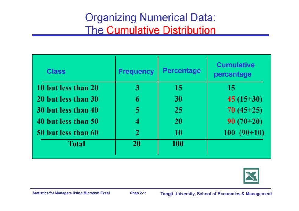
Organizing Numerical Data: The Cumulative Distribution Cumulative Class Frequency Percentage percentage 10 but less than 20 3 15 15 20 but less than 30 6 30 45(15+30) 30 but less than 40 5 25 70(45+25) 40 but less than 50 4 20 90(70+20) 50 but less than 60 2 10 100(90+10) Total 20 100 Statistics for Managers Using Microsoft Excel Chap 2-11 Tongji University,School of Economics Management
Statistics for Managers Using Microsoft Excel Chap 2-11 Tongji University, School of Economics & Management Organizing Numerical Data: The Cumulative Distribution Class Frequency 10 but less than 20 3 15 15 20 but less than 30 6 30 45 (15+30) 30 but less than 40 5 25 70 (45+25) 40 but less than 50 4 20 90 (70+20) 50 but less than 60 2 10 100 (90+10) Total 20 100 Percentage Cumulative percentage
Organizing Numerical Data: The Histogram A picture is worth a 1000 words A histogram is a chart in which the rectangular bars are constructed at the boundaries of each class The class boundaries (or class midpoints)are shown on the horizontal axis. The vertical axis is either frequency,relative frequency,or percentage. Bars of the appropriate heights are used to represent the number of observations within each class. Statistics for Managers Using Microsoft Excel Chap 2-12 Tongji University,School of Economics Management
Statistics for Managers Using Microsoft Excel Chap 2-12 Tongji University, School of Economics & Management Organizing Numerical Data: The Histogram A histogram is a chart in which the rectangular bars are constructed at the boundaries of each class The class boundaries (or class midpoints) are shown on the horizontal axis. The vertical axis is either frequency, relative frequency, or percentage. Bars of the appropriate heights are used to represent the number of observations within each class. A picture is worth a 1000 words

Organizing Numerical Data: The Histogram Relative Class Frequency Frequency Percentage 10 but less than 20 3 .15 分 Histogram:Daily High Temperature 20 but less than 30 6 .30 30 30 but less than 40 25 40 but less than 50 4 20 20 50 but less than 60 10 10 Total 10 1.00 100 5 3 1 51525354555More Statistics for Managers Using Microsoft Excel Chap 2-13 Tongji University,School of Economics Management
Statistics for Managers Using Microsoft Excel Chap 2-13 Tongji University, School of Economics & Management Organizing Numerical Data: The Histogram Class Frequency 10 but less than 20 3 .15 15 20 but less than 30 6 .30 30 30 but less than 40 5 .25 25 40 but less than 50 4 .20 20 50 but less than 60 2 .10 10 Total 20 1.00 100 Relative Frequency Percentage Histogram: Daily High Temperature 0 1 2 3 4 5 6 7 5 15 25 35 45 55 More Frequency
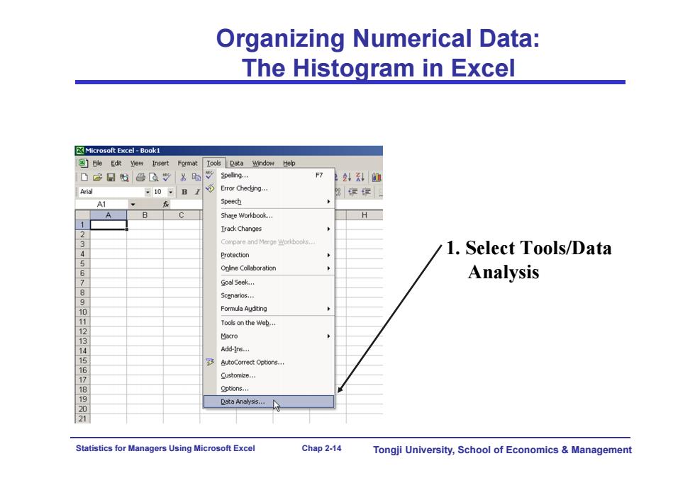
Organizing Numerical Data: The Histogram in Excel Microsoft Excel-Book1 Eile Edit yhew Insert Format Iools Data window Help d含日色"为时vg… 22:科们 Arial ,10-B Error Checking.. 3穿 A1 Speech Share Workbook..。 H Irack Changes Compre and Merge Workboos.. Protection 1.Select Tools/Data 6 ineCollaboration Analysis 7 Goal Seek... 8 5Cen¥ios., 9 Formula Audting 1 Toos on the web... 1 13 Macro 14 Add-Ins... 多 Options. 9 Customize... Options... ata Analys6… 21 Statistics for Managers Using Microsoft Excel Chap 2-14 Tongji University,School of Economics Management
Statistics for Managers Using Microsoft Excel Chap 2-14 Tongji University, School of Economics & Management Organizing Numerical Data: The Histogram in Excel 1. Select Tools/Data Analysis
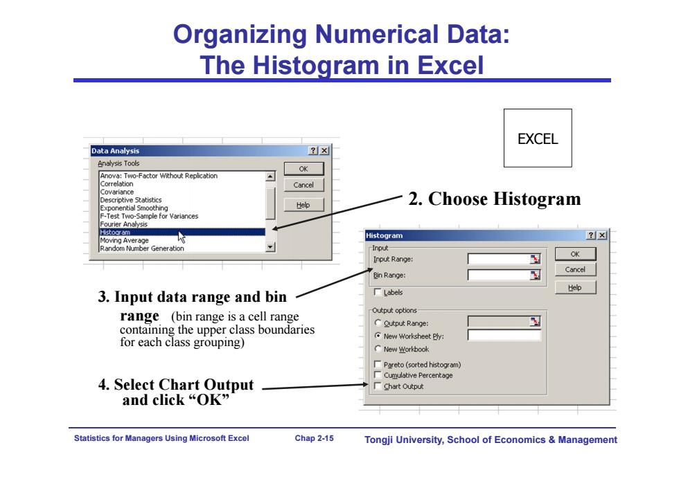
Organizing Numerical Data: The Histogram in Excel EXCEL Data Analysis ?x Analysis Tools Anova:Two-Factor Without Replication Cancel iotive Statistics Help 2.Choose Histogram Test Two-Sample for Variances Fourier Analysis shooram Moving Average Histogram x Random Number Generation Input- Input Range: OK Bin Range: Cancel Help 3.Input data range and bin 厂Labels Output options range (bin range is a cell range containing the upper class boundaries CQutput Range: for each class grouping) New Worksheet Bly CNew业crkbook Pareto(sorted histogram) Cumulative Percentage 4.Select Chart Output 厂hart Output and click“OK” Statistics for Managers Using Microsoft Excel Chap 2-15 Tongji University,School of Economics Management
Statistics for Managers Using Microsoft Excel Chap 2-15 Tongji University, School of Economics & Management 2. Choose Histogram 3. Input data range and bin range (bin range is a cell range containing the upper class boundaries for each class grouping) 4. Select Chart Output and click “OK” Organizing Numerical Data: The Histogram in Excel EXCEL